

The Public Theatre, Paula Scher.
See my previous post on Paula Scher here.
The brand identity for The Public Theatre, one of New York City's leading institutions for new theatrical productions, was created by Paula Scher.
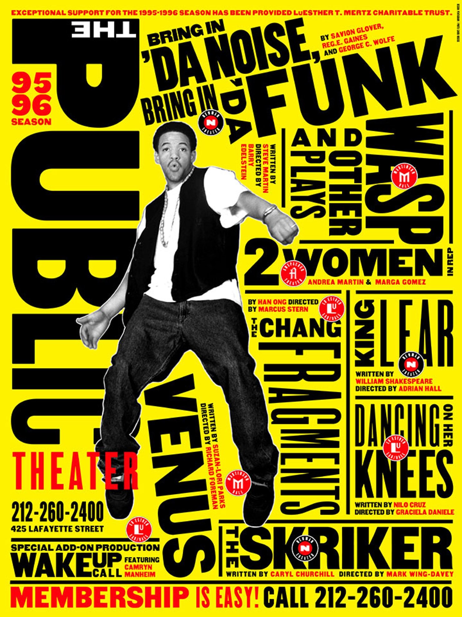
The brand identity that Scher created for The Public Theatre consisted of a unique approach to experimenting with type and it is clear that this has had a lasting impact on the industry as a whole. Experimental type is explored more freely, creating beautiful pieces of typography.
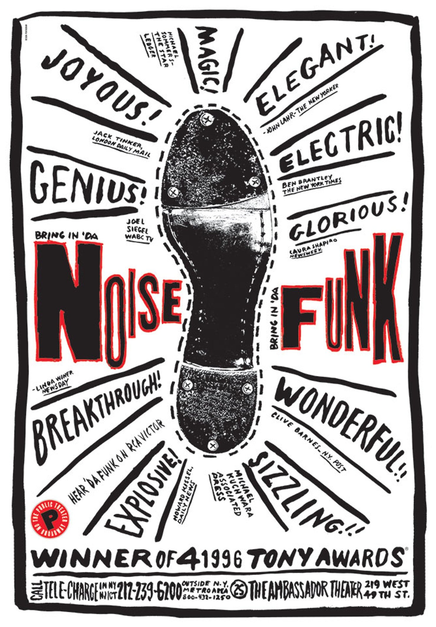
See below for posters for The Public Theatre.
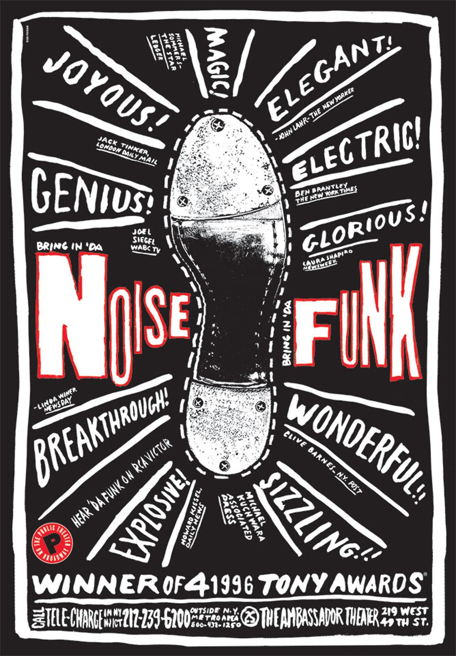
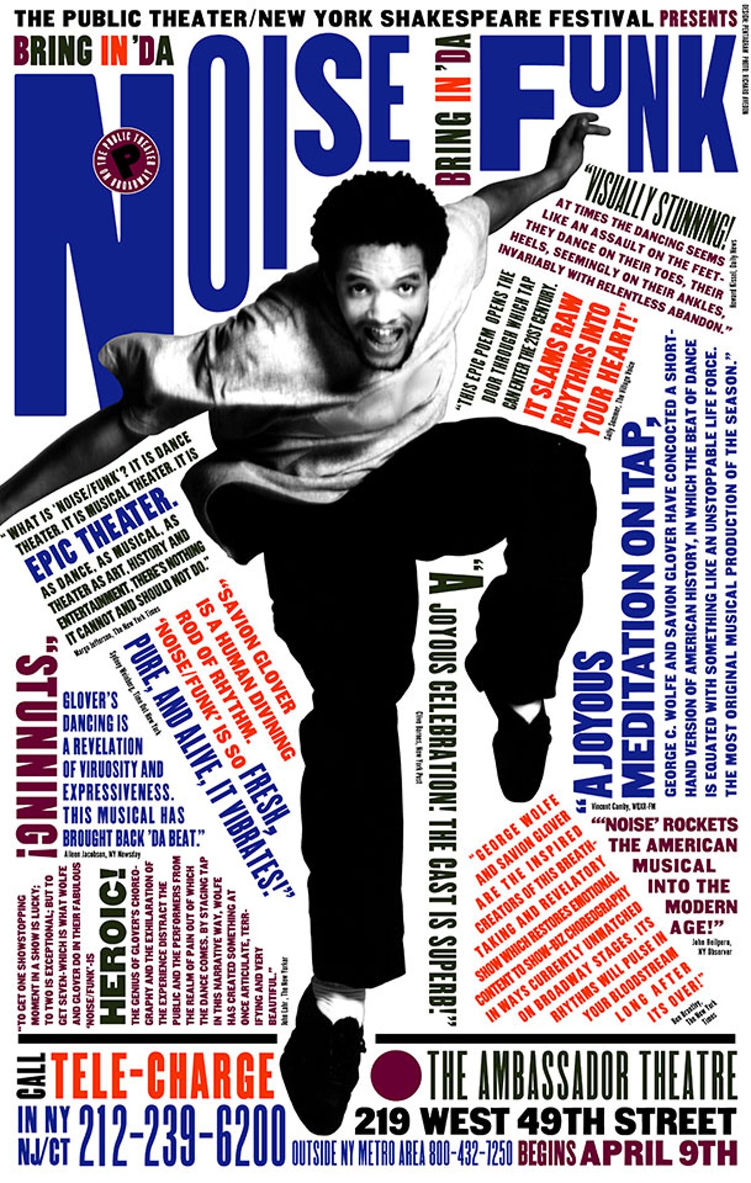


Personally, when working with type, I find it helpful and inspiring to refer back to works such as the posters for The Public Theatre as it encourages me to take risks and have fun with the letters and the way they interact with each other.
Hearing Scher talk about this project at The Future Design Conference in Dublin in 2018 was very refreshing and inspiring - it gave me the urge to experiment with typography.
Read more about The Public Theatre here.
Read more about Paula Scher here.
This blog is intended for educational and research purposes as part of my university degree.
All visual content included in the blog portion of this website, unless stated otherwise, is copyrighted to its respectful owners and will be linked back to them and the original source.
If you own the rights to any of the images included in this blog and do not wish for them to appear here, please contact me and I will promptly remove them.